FigmaWeb & App DesignFully Responsive UX/UI DesignUser Research
A fully responsive platform that rewards users with EarthTokens for completing surveys, usability studies, and interviews, which can then be donated to nature restoration projects.
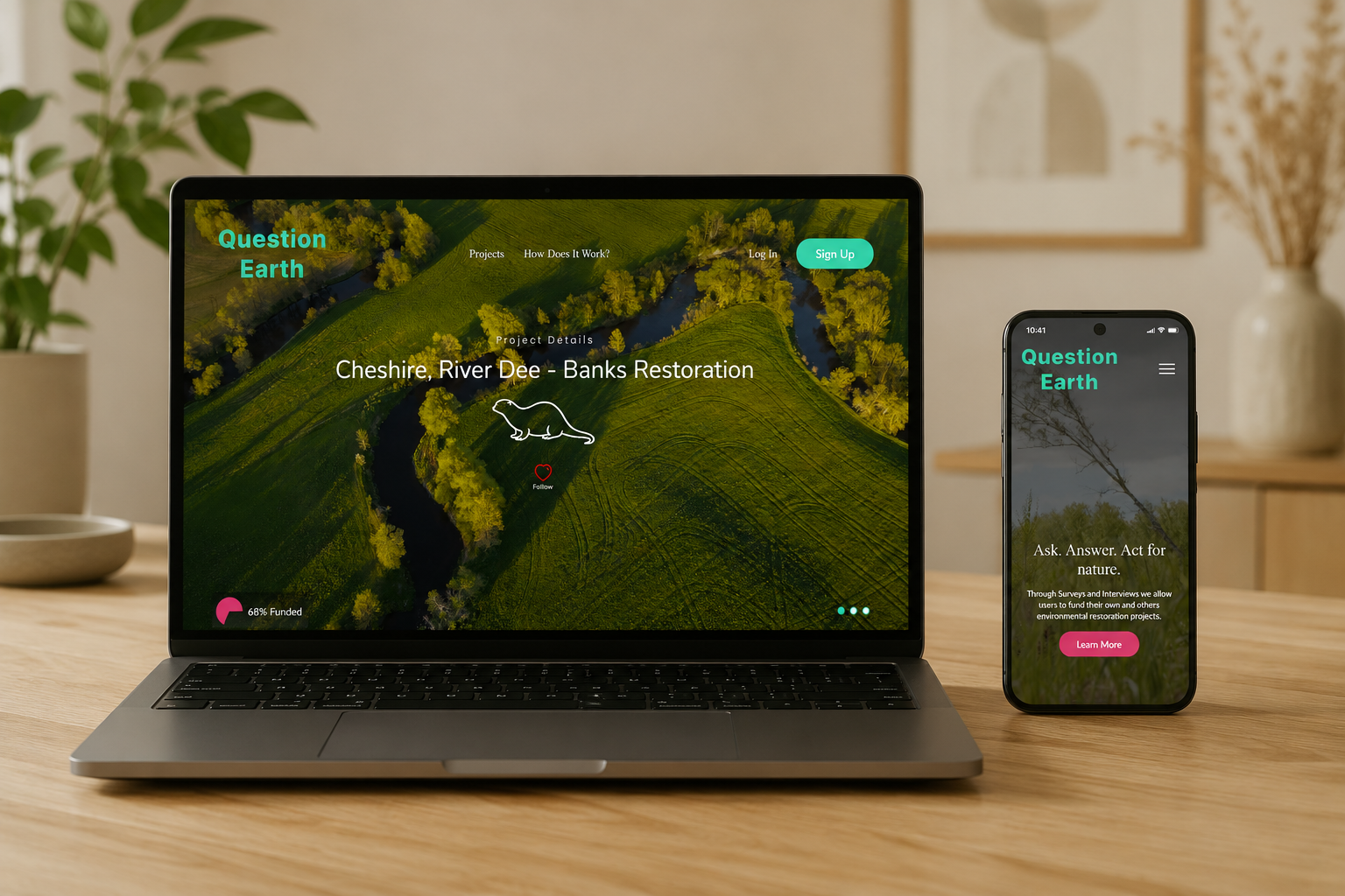
QuestionEarth is a fully responsive website where users can complete human insights testing to earn in-platform tokens to donate to nature restoration projects.
It allows:
Completion of surveys, usability studies and interviews for 'EarthTokens'.
Searching, donating and volunteering at all nature restoration projects posted on the site.
Project owners to receive more visibility on their projects and businesses to get human insights data while contributing to a positive cause.
Role: UX Designer & Researcher
Tools: Figma, FigJam, Adobe CC, Pencil & Paper (and Coffee)
UX Research
Research Goals
Understand user motivation and trust around donating personal insights, and validate the EarthToken reward model.
Competitive Analysis
Platform
Rewards
Strength
Weakness
UserTesting
Paid in dollars
Clean layout, clear tutorial, higher rewards than Userlytics
Very simple colour scheme, no incentive outside money
Userlytics
Paid in euros
Clean layout, clear user flows
Lower rewards than UserTesting, no tutorial
Secondary Research
Studies show people participate in research for a mix of altruistic and financial reasons.
Incentives drive uptake, but intrinsic engagement (purpose, impact visibility) is what sustains long-term participation.
User Interviews
Six users were identified, 3 who have donated to nature restoration in some form and 3 who have used a human insights platform to complete tests for money. All interviews were conducted remotely using Google Meet.
Affinity Mapping
Motivation & Values Alignment
“I like the idea of being able to find the kind of nature restoration I really agree with and donating to those. I could help a project in my area and see it!”
Trust, Transparency & Data
“I'd worry about greenwashing and that it's all a façade, it needs to make it clear where my data will go and what my tokens are worth.”
Rewards, Tokens & Value
“If it's not real money I need to know what its worth or it would feel pretty pointless.”
Usability & Engagement
“It should be easy to jump into a survey wherever I am, I don't want to waste time finding a test and I want it to be short or long by choice.”
Research Findings
Rewards must have perceived value
If a platform currency is used it must have a clear value and feel tangible, the impact it has should be clear and it needs to be worth the time to earn.
Users need to connect with the cause wherever they are
Users want to feel part of the projects and like their effort is having an impact they can see; impact tracking, updates and even volunteering could make users feel involved.
Trust and transparency are critical
Privacy and data use must be clear, company mission and language should build trust, not confusion.
Problem Statement
People want to contribute to nature restoration but lack accessible, low-barrier ways to do so, and existing human insights platforms offer no purpose-driven incentive beyond cash.
Question Earth is a human insights platform with a focus on nature restoration, for completing surveys, usability studies and interviews; it rewards users with tokens they can donate to a nature restoration project of their choosing. The platform is subscription free.
UX Design
Business Goals
To gain new users and trust
Retain diverse user base and regular testing completion
To incentivise businesses to take part for the positive outcomes and brand image
Design an intuitive and engaging onboarding experience
Launch a minimum viable product (MVP) quickly with essential features
User Goals
To contribute to nature restoration
To follow projects of interest and receive updates
To complete surveys for a reward
To volunteer with interesting projects
To be part of a community of like-minded users
Features Roadmap
Priority
Features
P1: Must have
Sign up & onboarding · All projects search · Profile & dashboard · Survey search · Donate & follow system
P2: Should have
Volunteering function · Map view search for projects
P3: Nice to have
Gamified rewards (badges or achievements) · Dark mode
P4: Can come later
Integration with social media to connect posts and volunteering footage to projects
UX Focus
Mobile First
Users told us they do short surveys on the go, on a commute or car journey, so the platform was designed mobile-first, then adapted up to larger screens.
Fully Responsive
Built to work across mobile, tablet and desktop using Figma's autolayout and a consistent design system.
Progressive Disclosure
Since the concept was unfamiliar to users, the landing screen stays minimal with optional 'learn more' sections, simple language, and generous negative space to support scan reading.
UI Design
Brand Identity
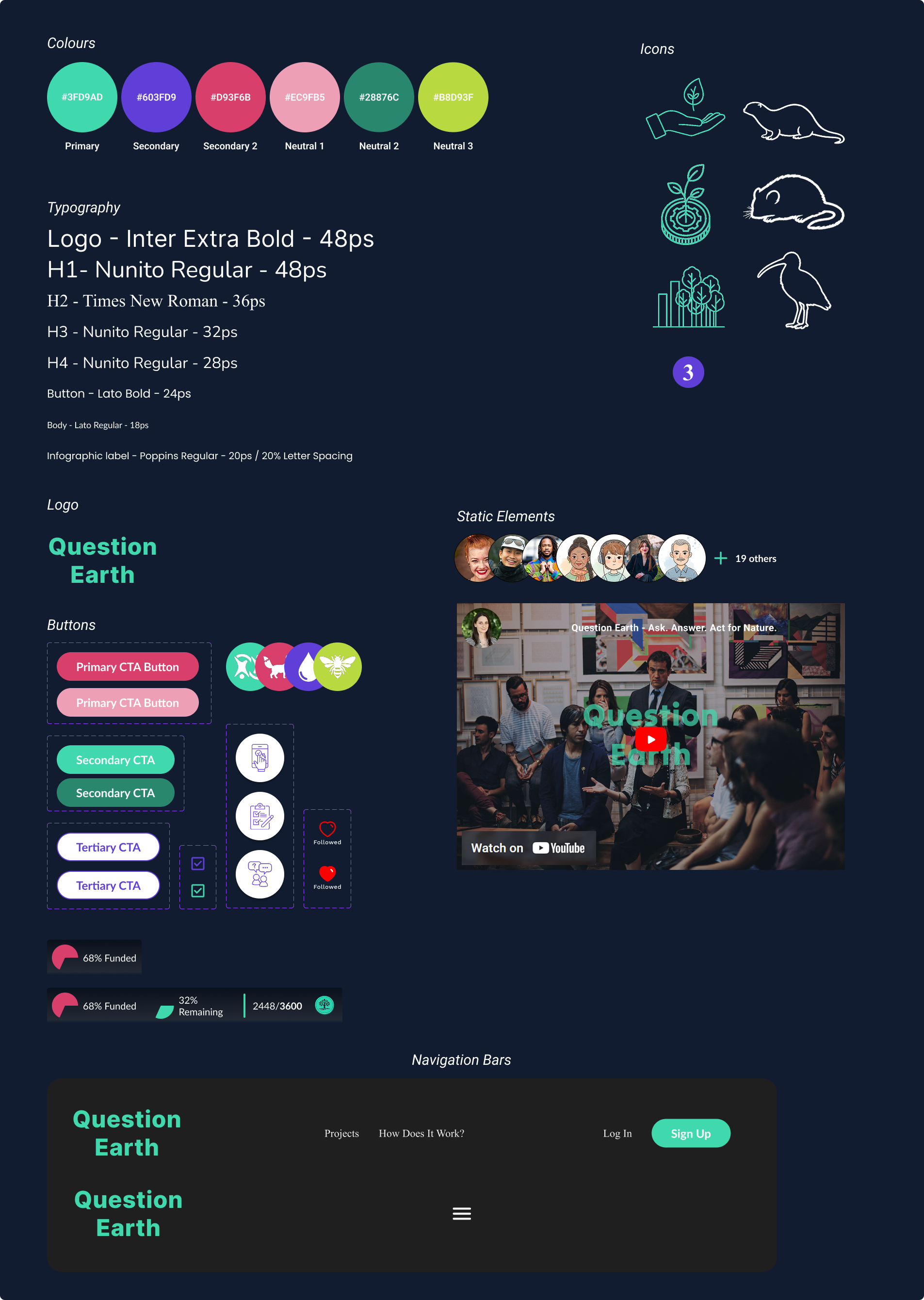
I wanted the app to have a vibrant colour palette, representing the regrowth of nature and the spring/summer colours. Competitors have opted for very similar, utilitarian, corporate designs; QuestionEarth is a fun, informal alternative, less about money, more about nature.
For the logo, I opted for a simple text logo to keep the platform name front of mind and complement the simple, spacious design.
Hand Painted Version 1Hand Painted Version 2Hand Painted Version 3
I opted for the Inter Extrabold Typography in 48px as it was most legible at all screen sizes and I felt it fit the brand identity.
Design System
A colour palette with 1 primary, 2 secondary and 2 neutral colours. Typography combines Tilt Warp (stylised headings) and Roboto (legible body text).
Fully Responsive Design
Breakpoint
Range
Margins
Mobile
412px–790px
20px width / 40px height
Tablet
790px–1045px
40px width / 40px height
Desktop
>1045px
80px width / 60px height
The header navigation switches to a burger menu on smaller breakpoints to avoid overlap.
The home page uses a hero video of a nature restoration project, plus a typing animation cycling through reasons users might struggle to commit to nature restoration.
Usability Testing
Prototype
Testing was split into two groups; 3 users on mobile and 3 on desktop. This case study focuses on the 'individual' user (completing tests and earning rewards). Prompts covered sign up, completing a survey, and donating a reward to a project.
Findings
Worked Well
General flow
Sign up
Understanding of concept
Sign up process
Needs Improving
Users wanted to know the equivalent currency value of tokens
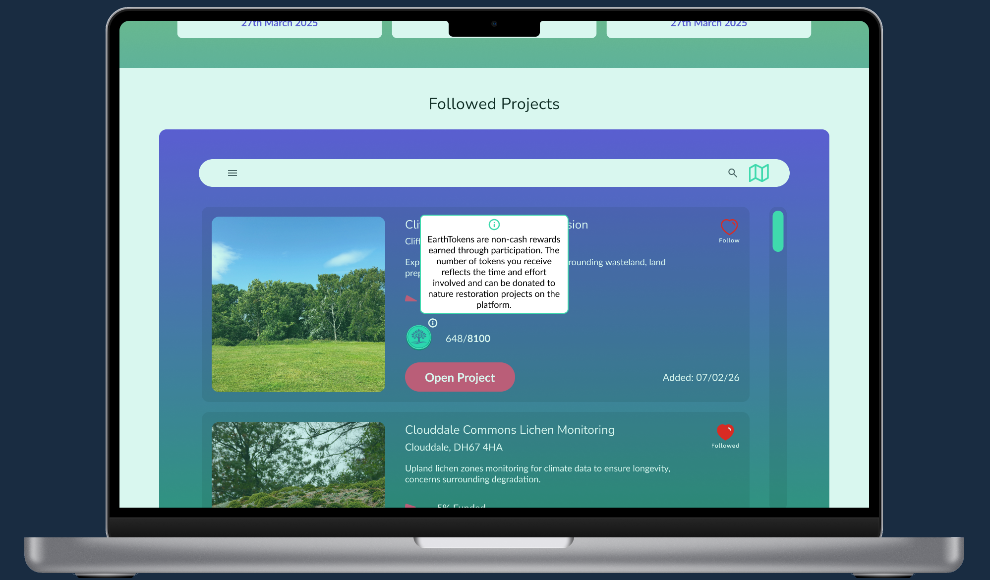
EarthTokens icon needed a tooltip; users didn't know what it was
Users expected a longer sign up process, wanted the option to complete their profile
Hero image transitions between project pages weren't clear
Iterations
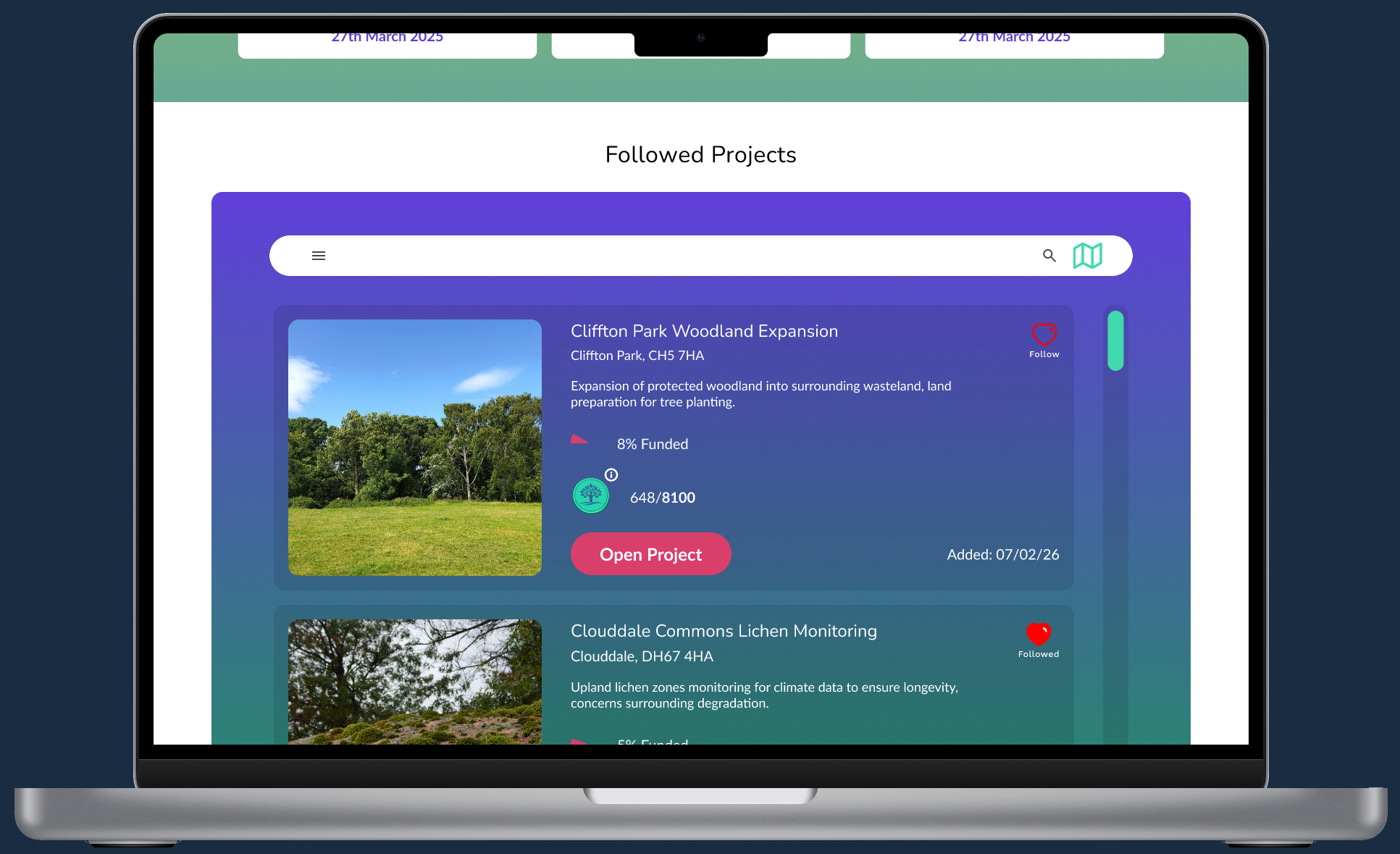
#1: Transition clarity
Some users didn't realise the page had changed when moving from the featured projects carousel to the project summary page (same image at the top caused confusion). Fixed with a slower, more obvious transition animation, plus arrows drawing the user to scroll down.
Original
New
#2: Tooltip
Added a tooltip to the EarthTokens icon, explaining its value, meaning and use for users who don't visit the info pages.
Tooltip
Tooltip Hover
Test Prototype
This Figma prototype showcases the core user journey through the Question Earth experience.