Overview
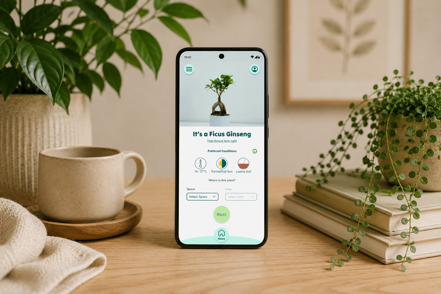
Dewit is a plant care tracking & sharing app.
It allows:
- Users to categorise plants by location within their home.
- Identify plants using AI and track water needs.
- Share watering needs with other app users.
Role: UX Designer & Researcher
Tools: Figma, FigJam, Adobe CC, Pencil & Paper (and Coffee)
UX Research
Research Goals
To explore how younger plant owners balance watering routines, especially when traveling or sharing plant care, and to uncover how a minimal, watering-focused tool can support consistency and reduce stress in plant maintenance.
Methodologies
- Competitive analysis
- User interviews
- Affinity mapping
- Task flow exploration
User Interviews
Four users were identified, all current/past users of plant watering apps. All interviews were conducted remotely using Google Meet.
Competitor Analysis
I reviewed three plant care apps to compare their feature sets, strengths, and weaknesses. The summary below pulls the key patterns from all competitors.
- All competitors rely on premium memberships and restrict key features behind paywalls.
- Free versions are limited: some apps offer basic plant ID and reminders, while richer features like plant care guides, light meters, and water calculators are often paid upgrades.
- AI plant identification and watering reminders are common expected features.
- Schedule sharing is rare, and apps that do offer it still struggle with onboarding and clarity.
- Strengths include clean modern UI, quick start experiences, helpful plant guidance, and useful tools like light meters and water need calculators.
- Weaknesses include confusing or busy interfaces, unclear navigation, paywall-heavy flows, inconsistent onboarding, and a lack of a truly relaxing experience.
Research Findings
Overwhelm is common, simplicity is key
Fewer features and clear UI/onboarding could be a powerful offering.
Subscriptions dominate the market
Most plant care apps are subscription-based, unintrusive ads and a simpler feature offering could be attractive.
Users want to share their schedules
Many users travel and need a way to share their schedule in real time without sharing credentials.
Personas
The New Plant Parent
Bio
Omar
27 y/o - Software Engineer
Omar recently started collecting houseplants and loves his home to feel a bit more alive, but his plants often look like they are dying and he's not sure why. He's tried plant care apps but just gets frustrated with the overcomplicated features and paywalls.
Goals
- Avoid more monthly subscriptions.
- Find a low-effort plant care reminder.
- Reliably keep plants alive.
Frustrations
- Overwaters or forgets to water plants.
- New to plant care and overwhelmed easily.
- Paywalls and confusing UI.
Frequently used apps
The Frequent Traveller
Bio
Kaitlin
36 y/o - Marketing Manager
Kaitlin is always travelling for work, but she loves having a house full of plants when she's home. She struggles to find someone to reliably take care of her plants while away and hates leaving loads of instructions & notes.
Goals
- Share plant care with friends/family.
- Keep plants alive while travelling.
- Track plant care digitally in real time.
Frustrations
- Returning home to dead/overwatered plants.
- Explaining what different plants need to others.
- Not knowing if plants are being looked after.
Frequently used apps
UX Design
Business Goals
- To gain new users.
- To quickly teach users how the app works and its benefits.
- Retain users and generate revenue via ads.
- Get their app to market with MVP (minimum viable product) and update over time.
User Goals
- To keep plants alive.
- To share plant care with others.
- To learn a good plant care routine that fits into their daily routine.
- To learn a new skill.
Project Goals
- Design an intuitive and engaging onboarding experience.
- Launch a minimum viable product (MVP) quickly with essential features.
- Encourage consistent app engagement to retain users.
Features Roadmap
| Priority |
Features |
| P1: Must have |
Sign Up & Onboarding · Plant Identification via Photo (AI Recognition) · Add & Organize Plants by Space/Home · Smart Watering Reminders / Schedule · Ad-Based Monetization · Dashboard / Home Screen · Shared Care / Collaborative Schedules |
| P2: Should have |
Custom Notification Timing · One tap notification mark as completed · Offline Mode · User photos, nicknames, and quick notes |
| P3: Nice to have |
Gamified Rewards · Integration with Weather Data |
| P4: Can come later |
Fertilizing / Repotting Scheduling · Automatic AI health diagnosis on adding plant · Customisable interface |
Information Architecture
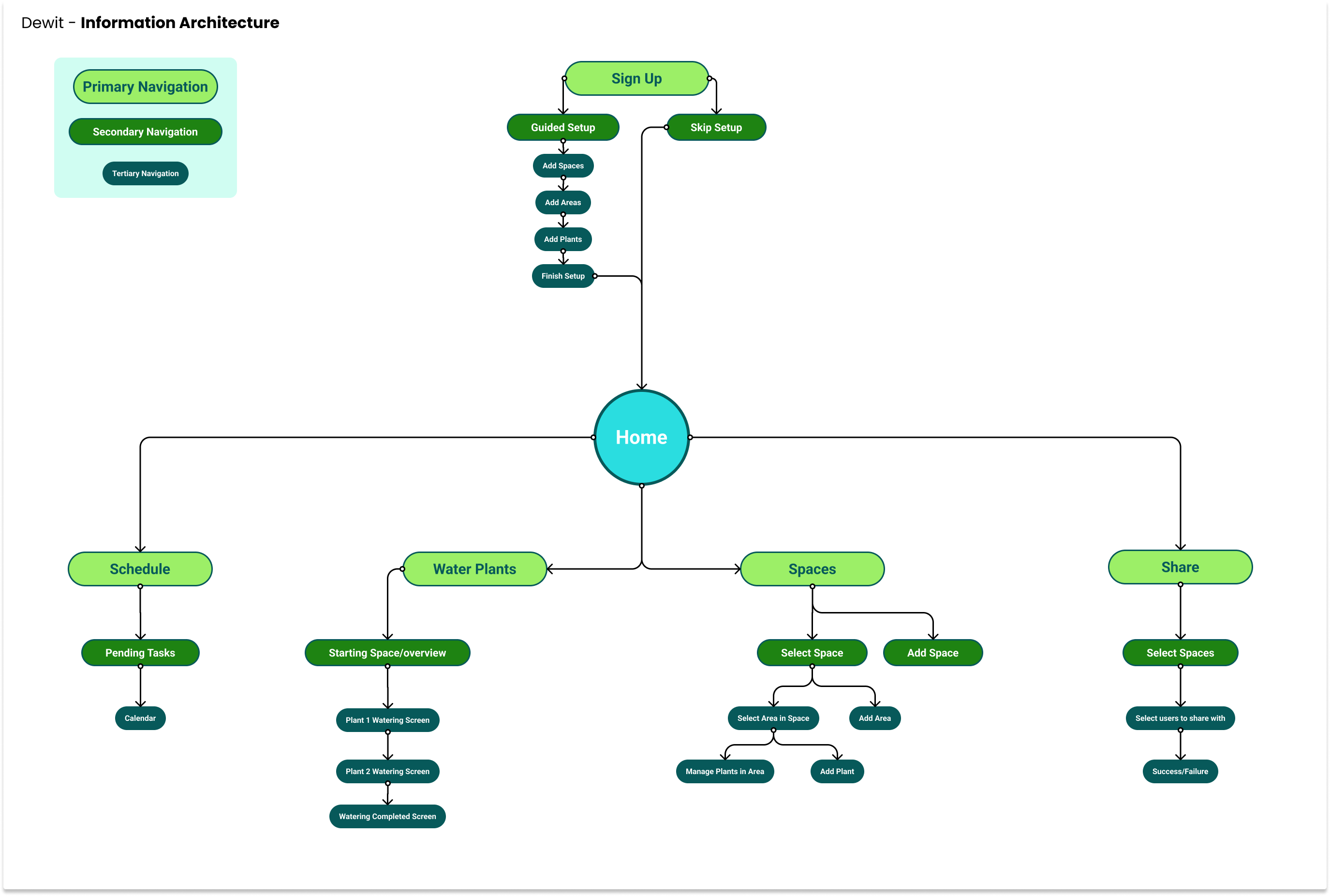
I've built a sitemap considering primary, secondary and tertiary navigation. Firstly, I've developed the primary navigation by defining which main actions users might have taken: Water, Schedule, Spaces and Share. Secondly, I've explored and expanded each one of those sections.
User Flows
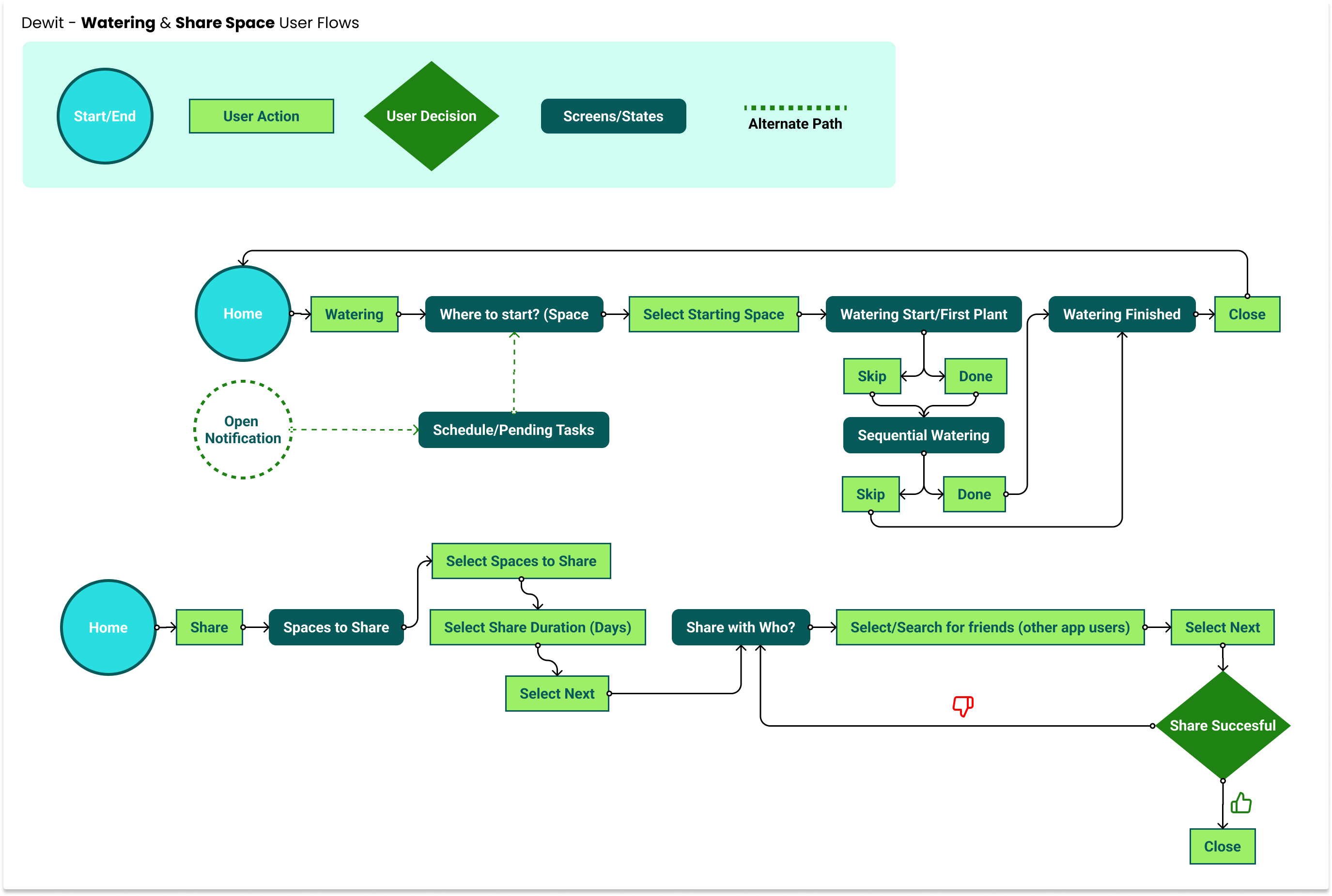
I've immediately identified my key user flows:
- Water Plants (through notification or opening app)
- Share Schedule
The idea here was that for my identified users to be able to actively use the application, they needed to be able to water their plants and share those schedules with friends, family, or house sitters.
Task Flows
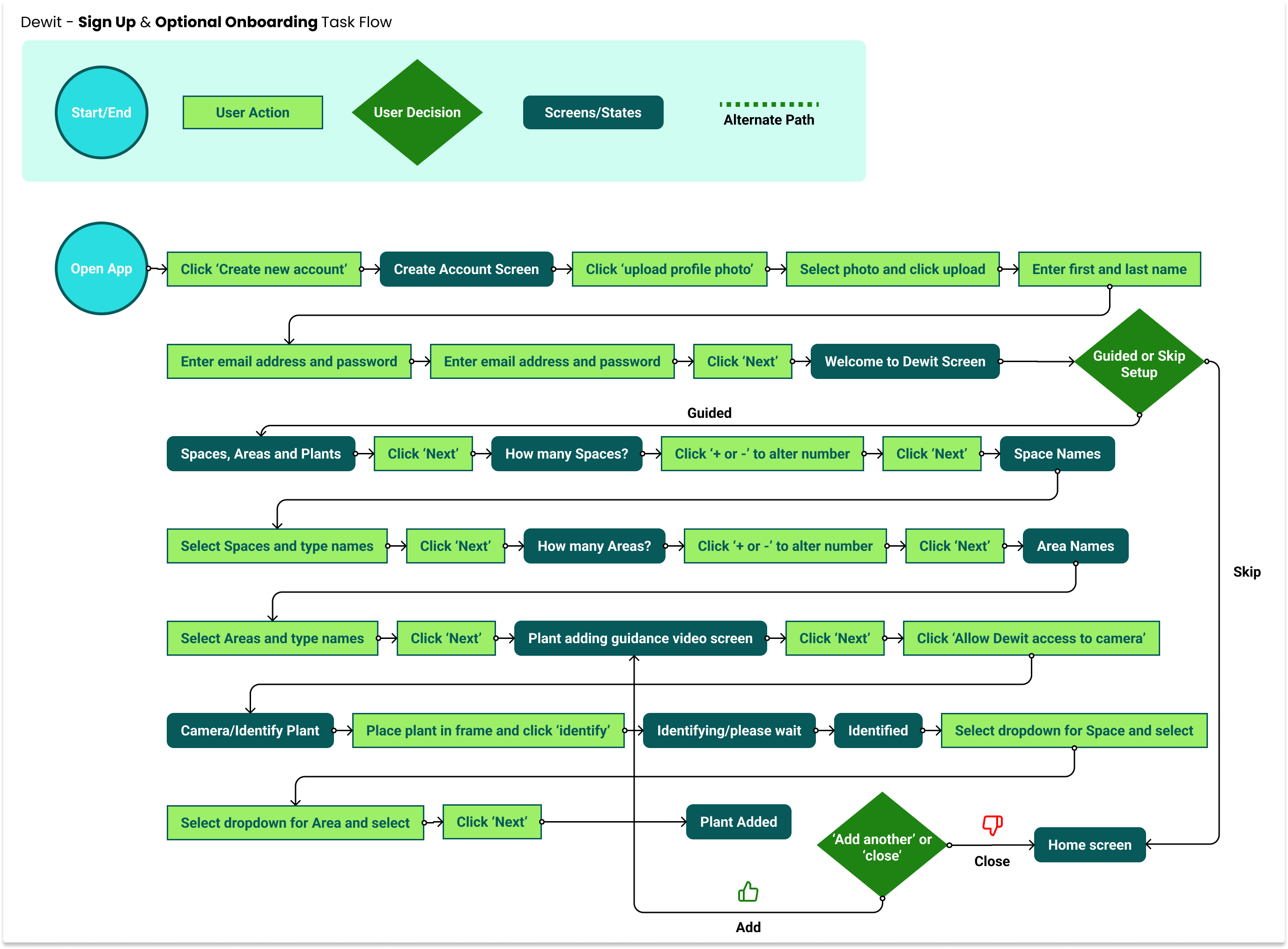
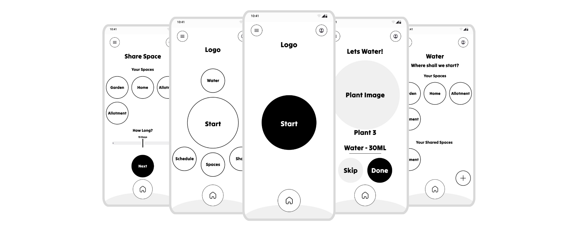
After designing key user flows, I turned my focus to task flows. In particular, sign-up and onboarding. I decided it would be appropriate to allow users to skip or follow a guided setup with more explanation on how the app worked. This gave good clarity on the number of stages that would be required for a sufficiently useful onboarding tutorial.
Wireframes
UI Design
Brand Identity
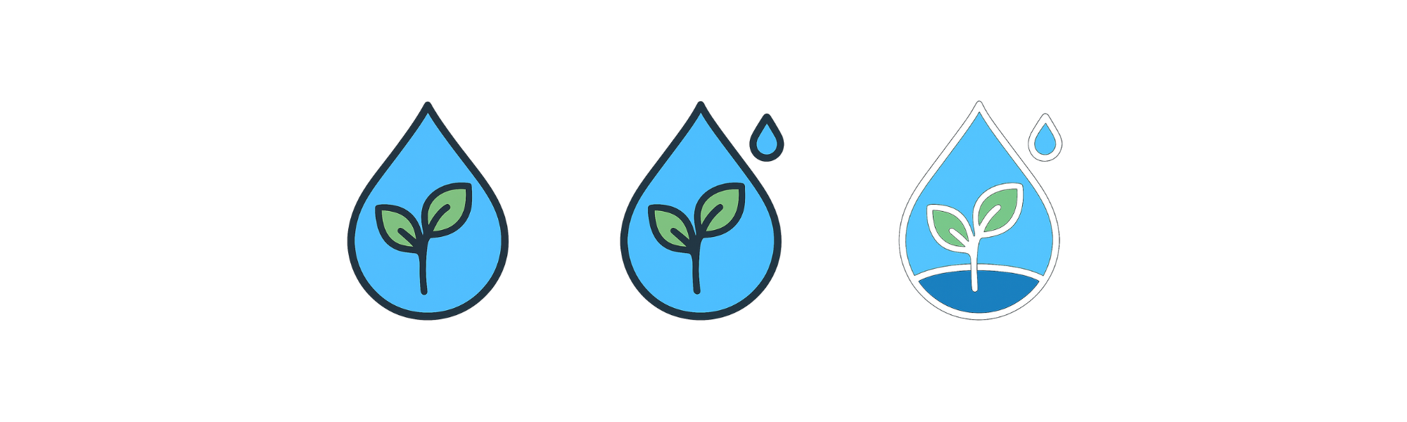
The focus of the app was on watering, simplicity and encapsulating all of our users plant care needs. Because of this I wanted the logo to be a water droplet with a plant growing within. I began by sketching out some rough ideas.
Once I had an idea I liked I used AI to generate a few versions based on that sketch, through 3 prompts I was able to get some good inspiration (like the additional smaller water droplet) for the design which I then hand illustrated.
Design System
I’ve created a colour palette with 1 primary, 2 secondary and 2 neutral colours. For typography I went with a combination of Tilt Warp and Roboto. Tilt Warp for stylised headings and Roboto for good legibility on smaller text.
Usability Testing
Prototype
As I've mainly worked with components and variants throughout the entire project it was quite straightforward to build up the prototype. In order to keep the flow nice and neat, I’ve mainly used the same mild transition effect for every screen except for the end of sign up transitions and when first reaching the end of the guided setup, where I went for a slower fade effect to give the idea that something new is about to start. Additionally, I built a water droplet loading animation to make the prototype experience more realistic.
Worked Well
- General flow
- Onboarding process
- Colour palette and minimalist UI
- Sign up process
Needs Improving
- Onboarding 'renaming' not obvious what is happening
- How do I add more details about the plant? pot size etc.
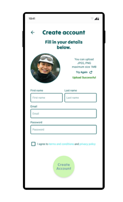
- Did the profile photo upload work?
Iterations
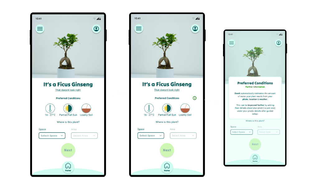
#1: Tooltip clarity
Some users were confused by the lack of detail they could add about the plant, like pot size, plant size etc. So I added a tooltip to give a bit more information on how the plant watering needs are calculated and where further details can be added.
#2: Upload feedback
Some users commented on the upload not giving feedback, it's assumed it's worked rather than confirmed. To clarify this I added 'upload successful' after image upload.
Test Project Prototype
This Figma prototype demonstrates the Dewit onboarding and watering flow.