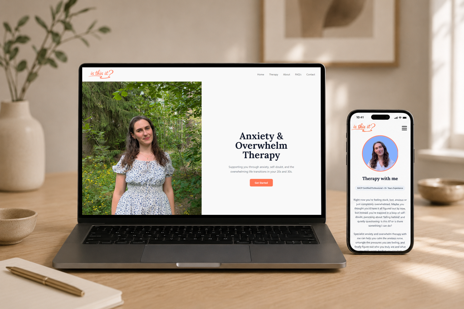
This project involved designing a marketing website for a therapy business targeting young adults aged 25-30 who are navigating identity, life transitions, and stress. The client had an existing website but had concerns of losing clients due to an outdated poorly functioning website.
The key aims of this project were as follows:
To create a visually appealing and user-friendly website that effectively communicates the therapy services offered.
To create consistent copy and branding with content currently on Instagram.
To improve conversion rates by implementing clear calls-to-action, optimising the user journey and reducing drop-off points.
To explore how other therapists in similar fields on Instagram obtain/convert new clients and how they reach the website and its primary purpose. And also assess what users are looking for in a therapist through Instagram and how the content can be tailored to encourage bookings.
Competitor Analysis
I first reviewed competitor therapist websites and found 3 with a similar offering. I analysed their Instagram marketing approaches to identify strengths, gaps, and opportunities for differentiation.
Calm and/or joyful colour palettes.
Clearly visible pricing (some therapists going as far as to explain their price point).
Always links back to the Therapist's Instagram.
Instead of offering a direct booking service, they opt for a free-form message about availability to keep barrier to entry low.
List relevant qualifications, testimonials and FAQs to build trust before booking form.
Always list the specific area of expertise or niche the therapy sits, and utilise client language to speak to their experiences.
Behavioural Analytics
The client's original site was built on Wix Classic, so I could access analytics and review user behaviour. Data was limited, but two drop-off points stood out: some users left almost immediately, before exploring the homepage, while others dropped at the pricing page, a more expected point since that's the first time they'd see pricing (it's not listed on Instagram).
I suspect the early drop-off was due to poor load speed: in testing, text sometimes took 7-8 seconds to appear.
Research Findings
Less is more
Instagram does the work of content and conviction, building trust and showing users why they want to book. The website just needs to extend that aesthetic, offer a brief summary of key information, and move them quickly into the booking process.
Users are primarily visiting via mobile
The majority of users are accessing the website from their mobile devices through a link shared on Instagram, labelled "book here". Mobile responsiveness is crucial.
Transparent and honest pricing
Users don't want to search for pricing, it should be clearly laid out and easy to understand what they are paying for. This builds trust and reduces friction in the booking process.
UX Design
Business Goals
Means for clients to easily specify what times would work for them with regard to their availability.
Improved conversion rate of users arriving at website via Instagram.
Clearer brand identity.
Updated content mirroring more recent Instagram content.
User Goals
Learn more about the therapist.
Read helpful, trust building content.
Find the price quickly and transparently.
Clearly understand the benefits and purpose of the therapy being offered.
Check availability and book a session.
Project Goals
Create relevant, easily readable content that utilises graphics where possible to minimise copy.
Build a brand identity through consistent colour use and copy tone.
Provide easy access to the booking system and transparent pricing.
UI Design
Brand Identity
Logo
Old
New
Colour Palette
#ff7a57
#87b1fd
#eef5ff
Typography
Display Typography (Headings)
Font: Lora (serif)
Weights: 600, 700
Use: Headings (h1–h3) for an editorial, warm tone.
Interface Typography (Body & UI)
Font: System sans-serif stack
Size: 18px (text-lg), relaxed leading
Intent: Performance-first, readable UI and body copy.
Components
Buttons
Icons
Comparison
Old website
New website
Conclusion
Improvements
Usability
Set consistent typography sizing, header hierarchy and reduced unnecessary text to improve skim reading.
Improved colour contrast and removed colour combinations with poor readability and contrast.
Reduced quantity of text and introduced graphics to break up text and increase variety.
Brand Identity
Used AI coding tools to rapidly build an SEO optimised, responsive and cohesive website to match the clients Instagram. Reduced unnecessary content by 40%.
Improved copy consistency to more closely match the relaxed, informal & friendly tone established on Instagram.
Utilised existing colour palette but distilled them down to neutrals (used for backgrounds) and accent colours for CTA's and drawing user attention.
Introduced a new serif font for headings to create a more editorial, warm tone and contrast with the sans-serif body copy.
Requested, edited and utilised photos of client with a similar style and colour balance.
Created a new logo that more closely fits the brand style and ethos through collaboration with the client.
Flow
Identified and eliminated cause of 60% user drop-off on arrival of original site.
Reduced the number of pages from 5 (Home, Work with me, About, Services, Contact) to 1 (Home) with anchors in the header nav menu, significantly reducing navigation points.
Swapped the booking form from a separate new window to be filled in site.
Added consistent CTA's to take user directly to the in-site booking form with transparent pricing listed immediately above.